Line Weights for Landscape Plans
Proper line weights give your drawing depth and clarity. Few line weights will make your drawing feel flat, while a variety, used in the right way, will assist in communicating your design as a three-dimensional space. Most importantly, proper line weights engage the viewer.

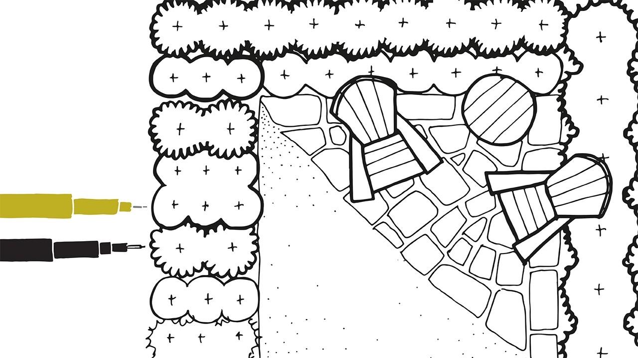
In general, objects closest to you have thicker lines, while those farther away have the thinnest. If looking at a plan view, the canopy trees would have the thickest lines, while groundcovers would have the thinnest.
The proper line weight is not about using a certain tip size identified on your pen, but instead how lines look in relation to each other. Always strive to have pens that can give you very thin lines all the way up to thick ones. This may mean creating a collection of writing utensils from different brands and different numbers. This is a skill that can take years to master, so I encourage you to practice and enjoy the process of creating space on paper. To see some options of pens I use please click here.
Below are some guidelines to consider.