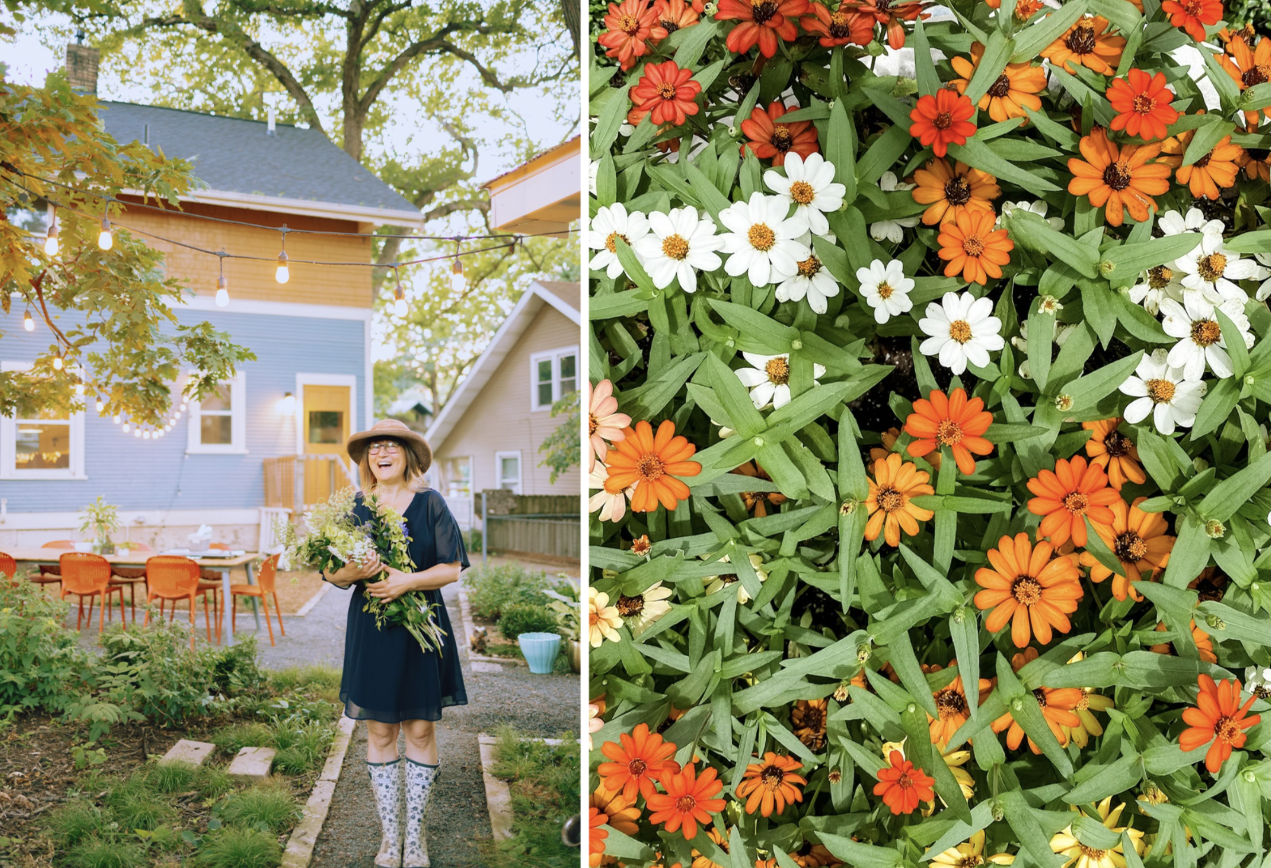
Orange in the Garden

I’ve always been drawn to cooler colors like green, blue, and purple. They feel calm and natural to me. Orange, on the other hand, felt like a stranger in my palette…too loud, too warm, too much. I admired it in other people’s gardens, but in mine, it felt out of place.
Then we moved into our current house, which is painted a cheerful blue and suddenly, orange started whispering to me. Not in the front yard, where the blues and purples still reign, but in the back, where I felt free to experiment. Maybe it was the blue siding asking for its opposite, or maybe it was because orange happens to be Tommy’s favorite color. Either way, I decided to give it a chance.
What surprised me is how alive the garden began to feel. Orange didn’t shout the way I feared…it glowed. It added warmth where shade cooled things and brought a sense of playfulness I hadn’t realized was missing. I love how you can use orange in subtle pops (like I do) or you can go all out and make a statement.
The garden above is my own in Des Moines, Iowa.
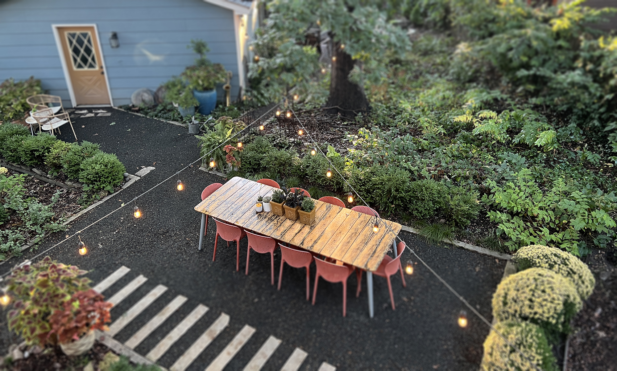
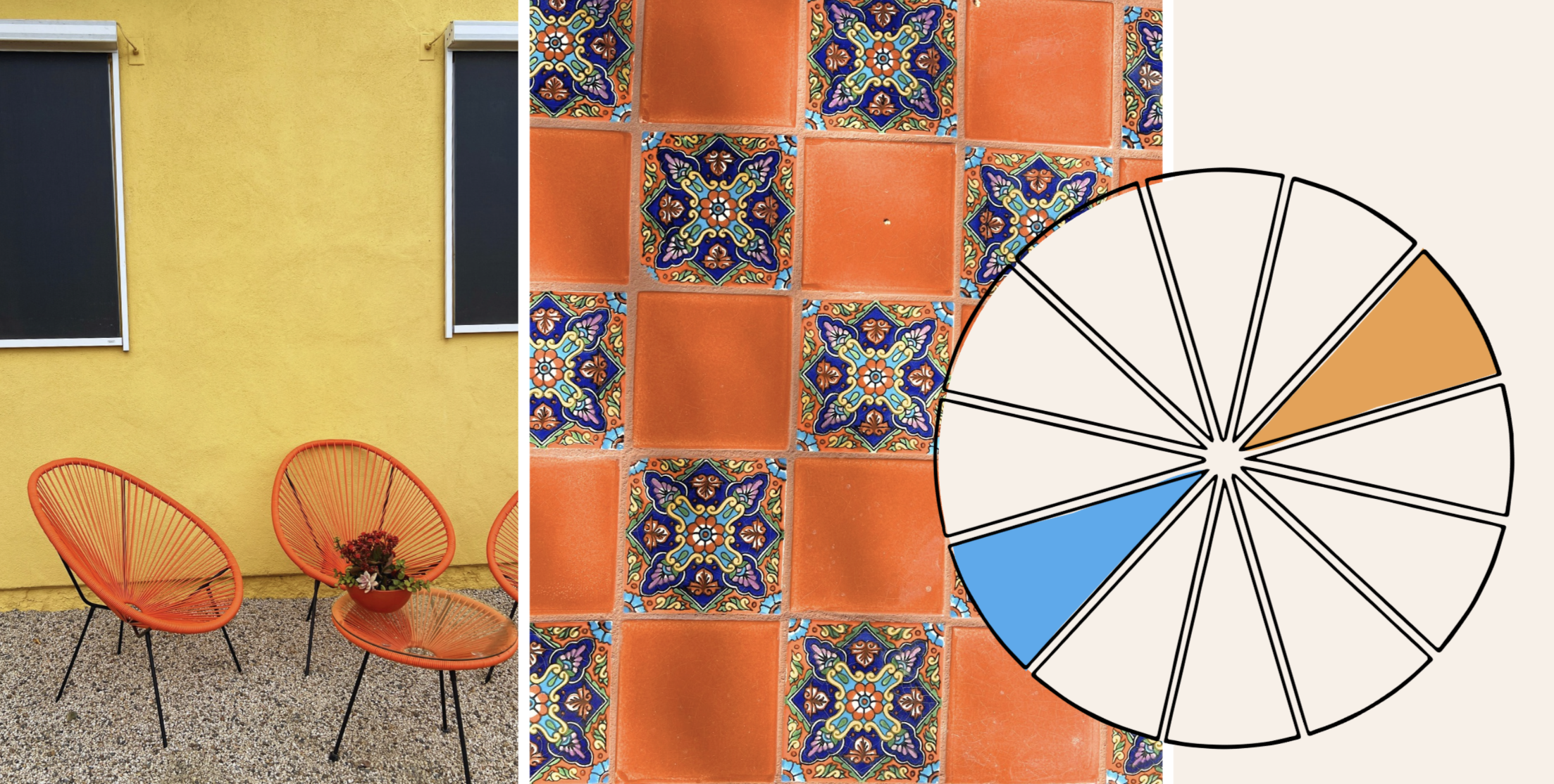
Orange and Color Theory
One reason orange feels so alive in my garden is simple color theory: it sits opposite blue on the color wheel. When paired together, opposites create a sense of energy and balance. Each color makes the other appear brighter and more vibrant. In our backyard, the blue siding of the house sets a calm, cool backdrop, which makes the orange flowers and accents pop without overwhelming the space. It’s a lively contrast that feels intentional rather than accidental, and it’s amazing how a few well-placed orange elements can transform a garden.
The garden above was designed by Greenhaven Landscapes in Lake Bluff, Illinois.
Mood and Personality
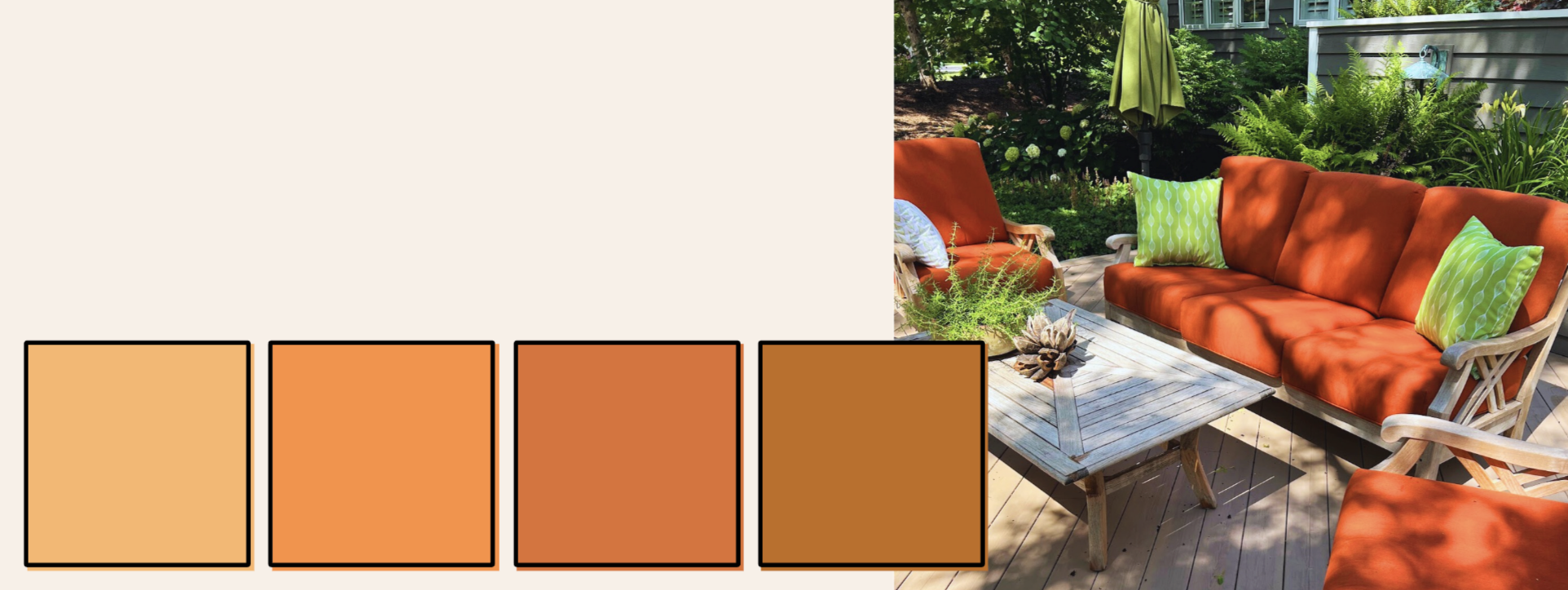
Beyond color theory, orange has a personality all its own. It’s warm, cheerful, and undeniably inviting. Where cooler tones feel calm and restful, orange brings a sense of energy and playfulness. It can make a shady corner feel bright, a simple border feel lively, or a quiet nook feel joyful.
Orange is also versatile. Soft peach and apricot tones can feel romantic or subtle, while deeper tangerine and rust shades add warmth and grounding. In our backyard, I’ve found that mixing these tones, whether in flowers, foliage, or garden accessories, keeps the color interesting and layered, rather than flat or one-dimensional. It’s a color that encourages movement, draws the eye, and, above all, makes the garden feel alive.
The garden above is my own in Des Moines, Iowa.
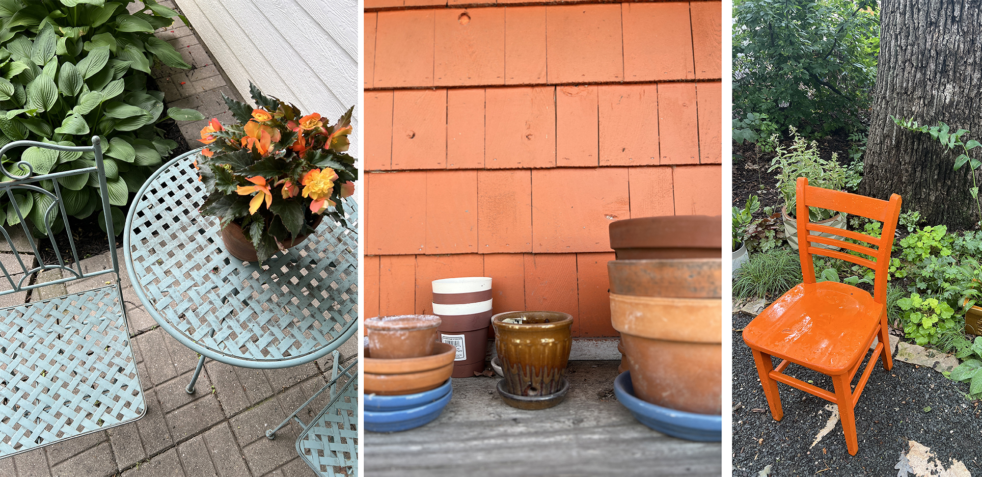
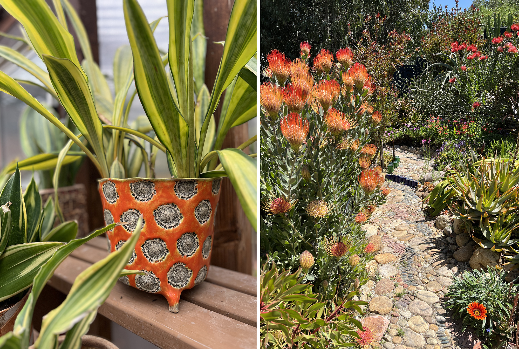
Where It’s At
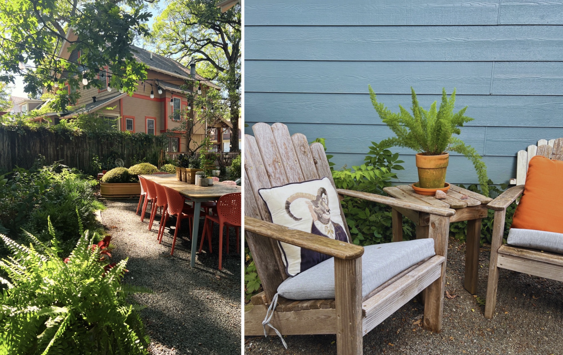
Orange can appear in so many corners of a garden...sometimes in unexpected ways. In our backyard, we’ve embraced it across multiple layers: the exterior doors of the house and garage, raised metal planters, chairs, obelisks, foliage, and even pillows. Each element brings a slightly different shade of orange, from soft apricot to deep rust, creating a sense of depth and cohesion.
Flowers are a great source of orange, but don’t forget subtler touches like foliage with copper or rust tones, the patina of metal planters, plus terra cotta pots. Even our neighbor’s house happens to have orange accents, which feels like an unplanned complement to our garden (see the photo above).
By spreading orange across different surfaces, textures, and tones, it becomes part of the garden’s personality…and that’s what makes it feel playful, lively, and completely at home.
The garden top left was designed by Patrick Anderson in Fallbrook, California.
Using Orange Thoughtfully
Orange is bold, so a little goes a long way, but it doesn’t have to be overwhelming. Here are some tips for incorporating it thoughtfully:
- Use it as an accent. A few well-placed pops of orange, whether in flowers, cushions, or small garden structures, can make the space feel lively without dominating it.
- Pair with cooler colors. Green, blue, and purple balance orange’s warmth and help it feel harmonious rather than jarring.
- Mix shades and textures. Combining soft apricot, bright tangerine, and deep rust tones keeps the color layered and visually interesting. Pairing smooth, shiny surfaces with rough or textured ones can also enhance its appeal.
- Consider light. Orange glows differently in sun and shade. Place brighter tones where they can catch sunlight, and softer shades in corners or under trees for a gentle, inviting glow.
Embracing Orange
I never expected orange to find a home in my garden, but now it feels like an important part of it’s personality. It reminds me that color isn’t just about what we think we like…it’s about what brings energy, warmth, and joy to a space. In our backyard, orange doesn’t compete with the blues, greens, and purples I love. Instead, it complements them, creating balance, movement, and a little bit of playfulness.
Sometimes, introducing a color that feels “foreign” can open up new possibilities in a garden and in the process, teach us something about our own tastes, instincts, and creativity. For me, orange has become more than a color; it’s a reminder to experiment, take risks, and let the garden surprise me.
The garden on the right was designed by Jim Bishop in San Diego, California.
INSPIRATION
Speaking of repeating colors… I recently wrote an article for Garden Gate Magazine on Repetition in the Garden (Fall 2025 issue). It’s full of ideas on how repeating shapes, materials, and colors can give a garden rhythm and flow. Click here to grab a copy.
Did you catch my past color posts? You can check those out here.
We also covered color a bit in our 10x10 Garden Design Tips email series. Learn more here.
What's a color you’ve discovered unexpectedly works in your garden?