Simple Lettering for Landscape Plans
Each year when I teach hand lettering in my landscape graphics class ultimately someone says "I can't do this. My printing is too messy." I truly believe anyone can sharpen their lettering skills, so I created these simple tips to help. In the end, your design looks more professional if your lettering is legible and organized, so its well worth the effort. For those that create landscape plans digitally, enjoy this tutorial for doodling, scrapbooking, card-making, and sketching instead. As a bonus, I've included a lettering video at the end of this post too!
SOME TIPS TO IMPROVE YOUR LETTERING SKILLS
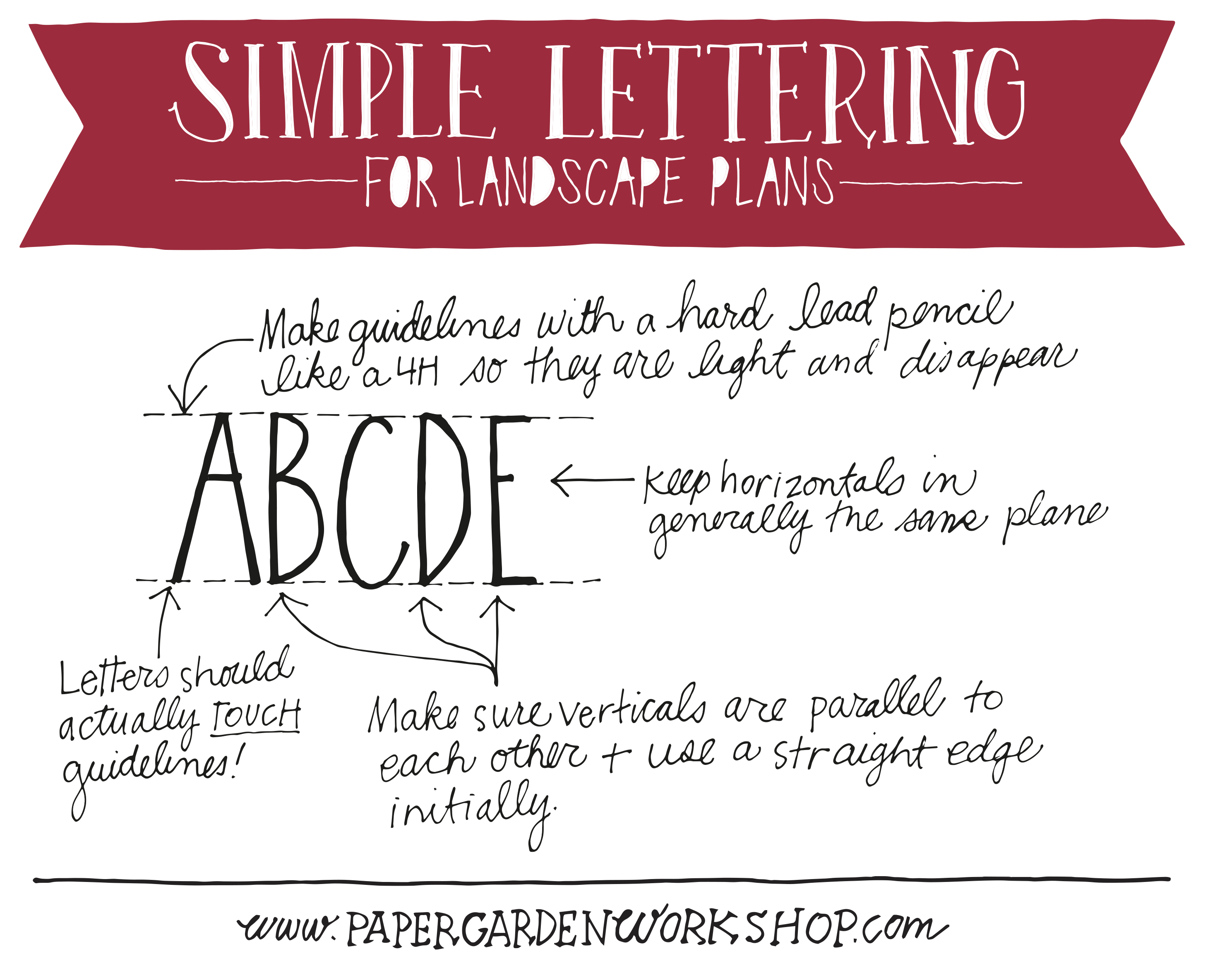
1. Draw guidelines at the height you desire. Please use light lines, so these don't compete with your lettering. I suggest a hard lead pencil like a 3H to a 6H. Never use ink for guidelines. You can use a ruler to measure these or a handy-dandy Ames Lettering Guide.
2. Draw your lettering in pencil first (with hard lead once again). This will help you get the spacing correct. If these are light enough you don't even have to erase them after the ink is applied.
3. Now you can ink in your letters. Once you become more confident you can skip step #2.
4. When drawing your final letters make sure they touch both the top and bottom guideline. When you stray from this your lettering becomes messy.

5. Another key component to nice lettering is keeping the vertical lines parallel to each other. Even if you want to italicize your letters, just be consistent with your angles.
6. How do you keep verticals parallel? Use a ruler! This is a great way to add neatness if you have a shaky hand. Just free-hand anything with a curve or angle (like Rs,Ps, Ks, Os, etc.).
7. Keep all your horizontal connections at relatively the same level. If the cross bar on your A is high, keep it high on your other letters. Consistency is key.

9. Plant labels are typically 1/8" tall, while labels for areas and structures can be slightly larger.
10. Practice and enjoy the process!

I've also included a video below to show how I create basic lettering, plus one with a little bit of flair.